Improving Shiken's Onboarding Experience
Shiken reached out to us to improve their onboarding journey in their application.
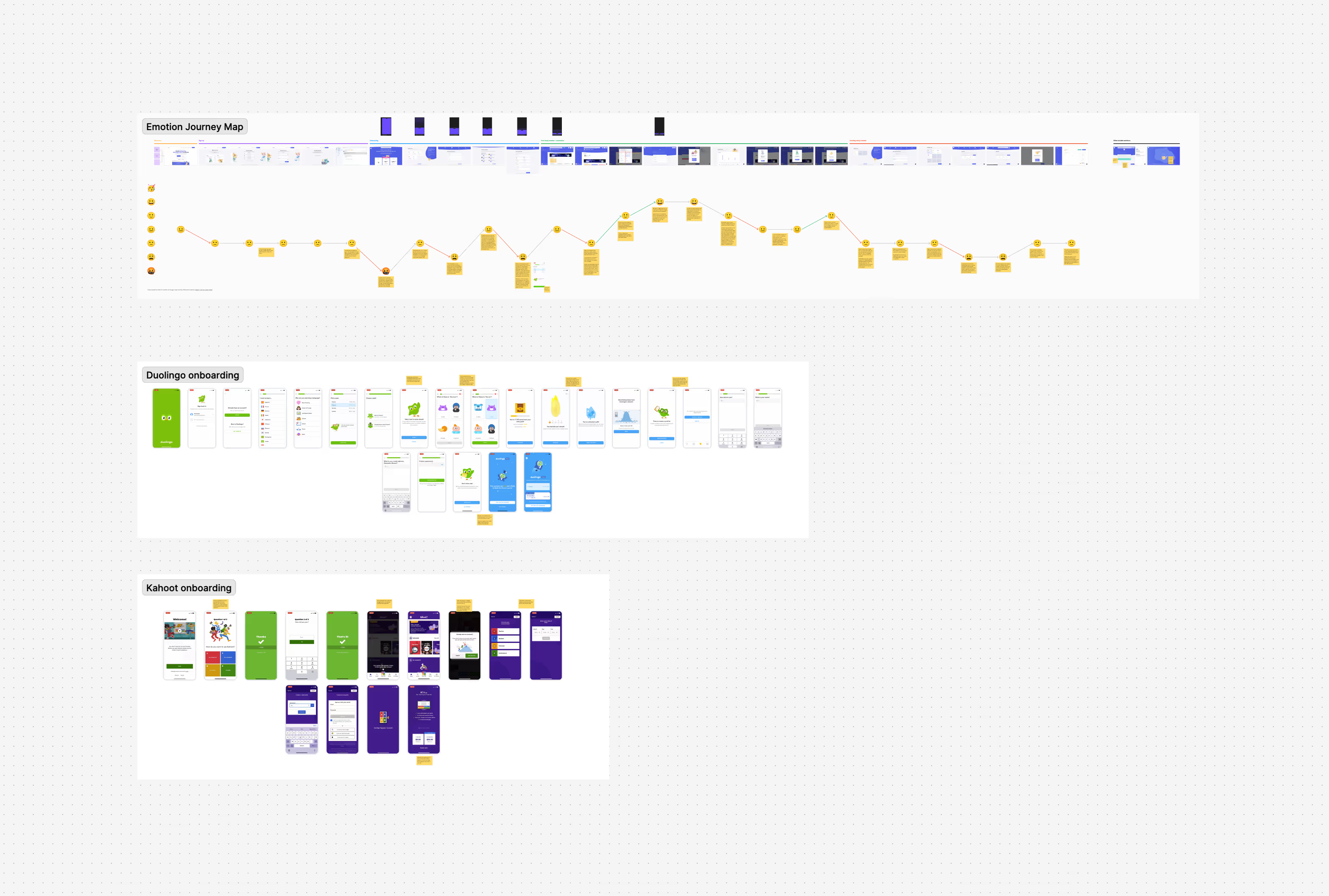
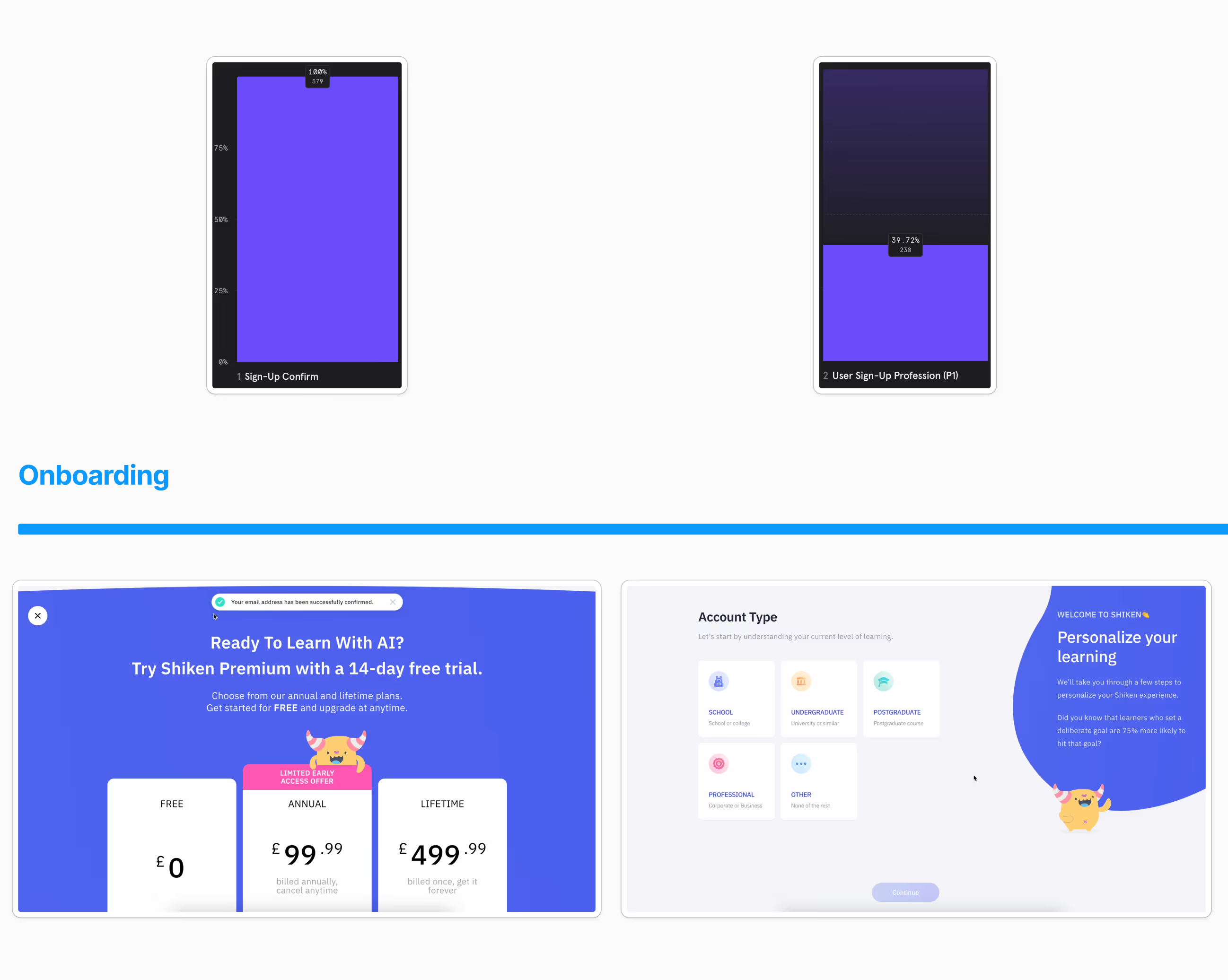
We analysed their onboarding flow with heuristic experience, while considering the funnel data Shiken provided to us through Mixpanel. We found there were key points in the journey where there was excessive user drop-off, which we presented to Shiken and suggested fixes for.
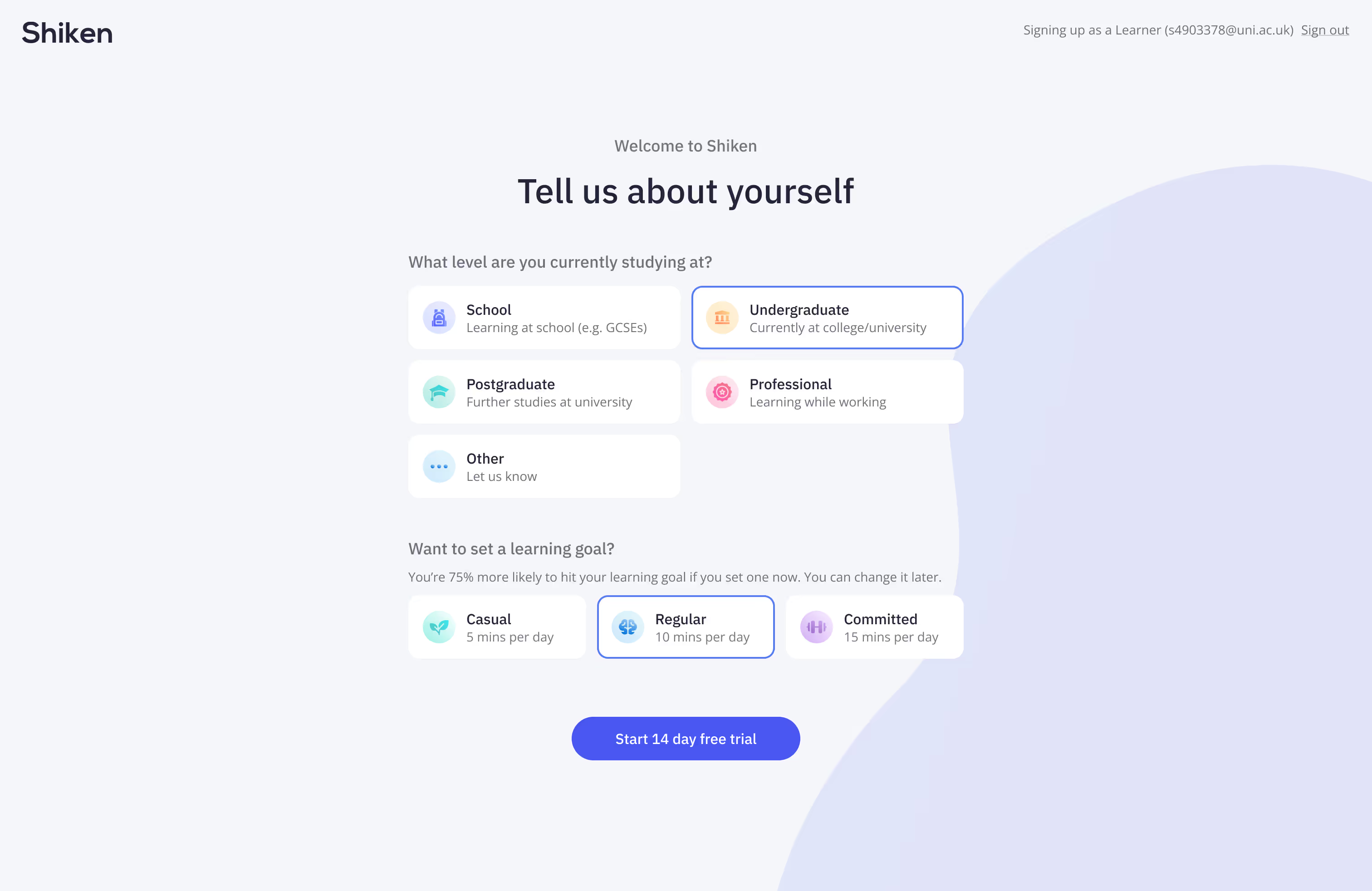
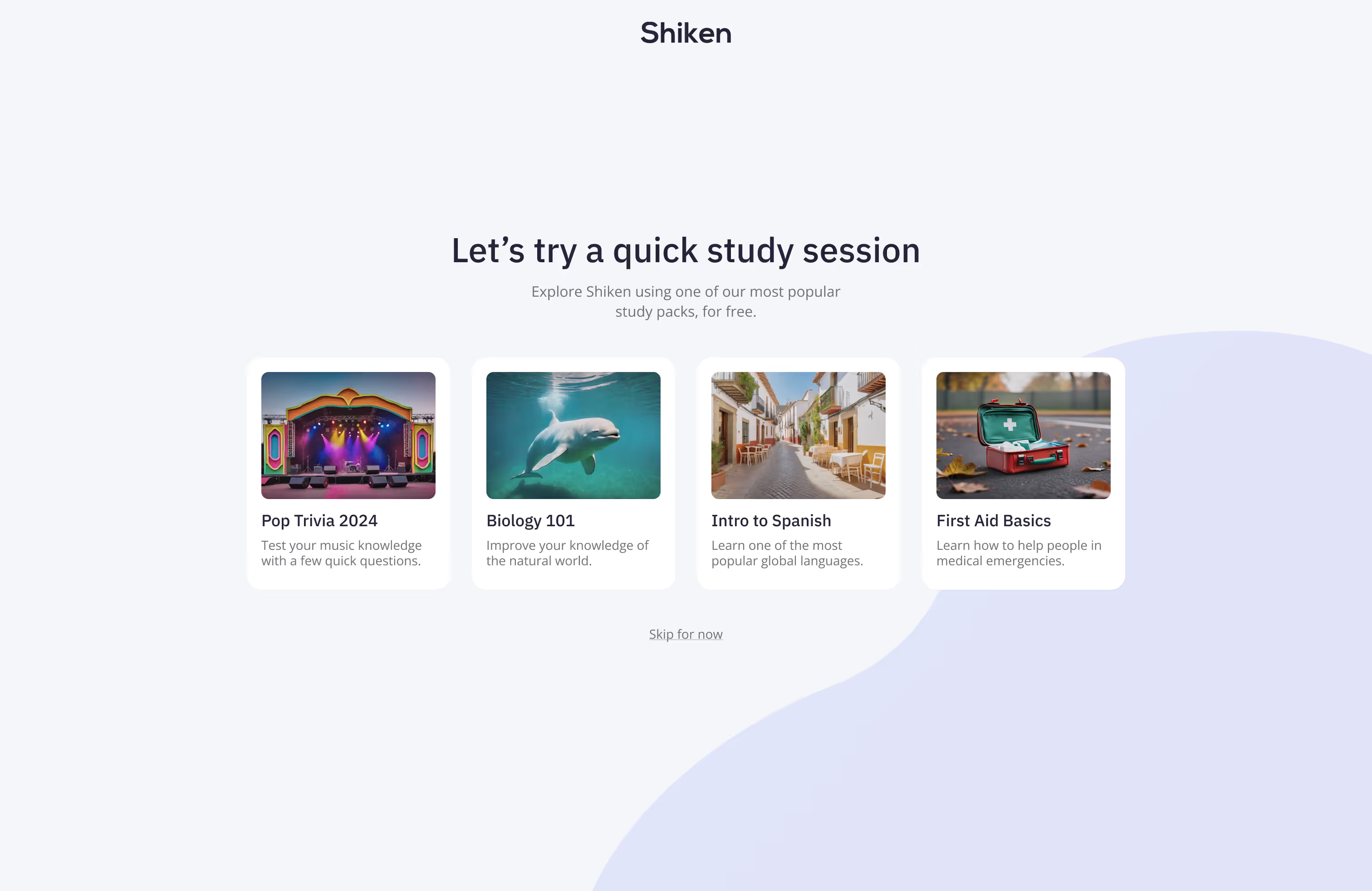
Shiken approved our suggestions and we began redesigning both the user journey for onboarding for both learners and educational technology creators, alongside the user interfaces for that journey.
Our focus was on simplifying the process, easing the cognitive load on the user and ensuring the UI is modernised and matches the Shiken brand.
We designed and prototyped the entire new journeys, including micro-animations, and supplied these to Shiken.
Shiken are now in the process of developing these changes and releasing them to their users.


